Wednesday 16 December 2015
Tuesday 8 December 2015
Examples of genre

- The shot types vary slightly from mid-shots to close ups. They do this because they want the consumers to focus on the artist this way when they see the artist their attention is focused on the artist. The camera angle for all my pictures remains consistent throughout VIBE and XXL. The lighting in all the magazines are are bright making the The costumes tend to be plain (usually black or white) to make them lighter and focus's the readers attention on the artist rather than his or her's clothing. The representations shown are rich black males that tend to have tattoos and jewellery to show their success and fame. The background colours are black or white they do this to divert the readers attention to the artist and cover lines.


Colour scheme

The colour scheme that I could use for my music
magazine. I'm planning on using strong bold colours because they are common in
rap and hip hop magazines. This will help categorise my music magazine in the
rap/hip-hop genre.
Monday 7 December 2015
House styles

As you can see I've chosen 'vibe' as my music
magazine and as you can also see the house styles is mostly the same on all the
magazines. In all the magazine covers the masthead is a bold, large and clearly
visible. The masthead is the same every time so existing audiences can easily
identify a vibe product. The colours of the mastheads are all bold colours and
tend to change. The main image is always an artist and the artist is either in
front of the image or behind. The background is basic in most cases. The cover
lines are never over the face of the artist so the audience can identify who is
on the cover and the name.
Sunday 6 December 2015
Thursday 3 December 2015

Magazine cover and contents page draft 2

I have taken feedback from my peers and my teacher
and made adjustments by making it less busy, adding colour and re-sizing my
logo.


Feedback from my peers

This the feedback I received from my peers
and my teacher on my magazine cover. I have now received the feedback and will
make adjustments to my work based on this.
This cover is my first draft.

This cover is my first draft.
In my magazine I have used a masthead, cover lines, logo's
and a image for the front cover. The masthead name that I have chosen is
'Plantsbrook news'. I have chosen this because from the name the audience tells
us that the magazine is going to be about things happening in plantsbrook. I
got the masthead made from 'Dafont'. The image and cover lines support this
because the image show's a student in school uniform and the cover lines talk
about things happening in the school. The main image is a photo of a student
who is currently in plantsbrook sixth form. The use of a sixth form student
tell's us it's aimed at sixth form students. The student is the largest object
on the screen so all attention can be focused on him. In my cover lines I talk
about things that a sixth form student or someone who is about to enter sixth form
might find useful, things like revision tips and after school clubs. I have
placed the logo underneath the masthead so that people fully understand that
the magazine is about plantsbrook. I've already talked about my target audience
being sixth formers but can also be aimed towards year 11 students because this
will give them a taste of what sixth form can/will be like. I have used a range
of techniques to attract the readers attention like a large image of a student
which the readers can relate to, different coloured cover lines to make it more
attracting and a large masthead.

Sunday 8 November 2015


Thursday 5 November 2015
Thursday 15 October 2015
Two more magazine cover design's


Tuesday 6 October 2015

My magazine cover design
These are my cover designs for my magazine, the mastheads are placed in different places in the page so I have a range of different designs.


Monday 5 October 2015
Photography
In these two lessons I learnt how to apply my camera angles knowledge in my photos.
Created with flickr slideshow.
Created with flickr slideshow.
My first school magazine cover

Tuesday 22 September 2015
Masthead analysis


The masthead is 'class'. It's written in bold writing all uppercase in
black font. It has a white outline and another outline outside that but in blue. The background is a opposite colour to make it stand out. The masthead is 'Honor student'. It's got a time's new roman font to show the professional/higher education look to make it look like it's for adult's or older teenagers.
The masthead is 'Independent school'. It has two different colour's to make the masthead standout, also the text is different on different words to make it stand out.

Monday 21 September 2015

Thursday 17 September 2015
Music magazines
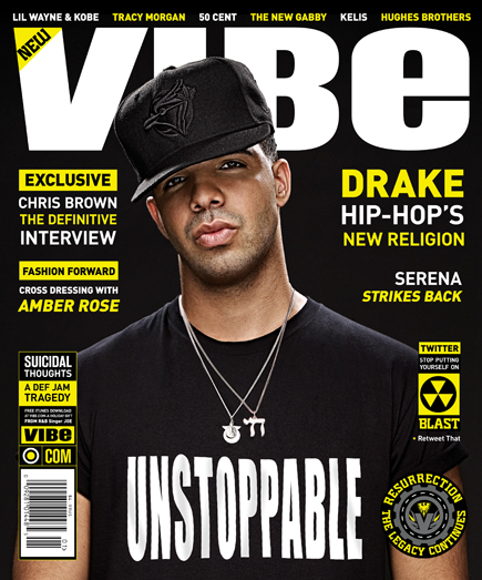
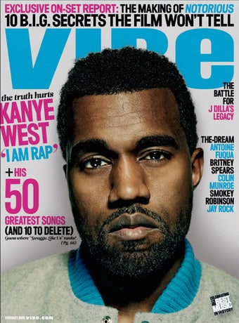


They all have a black/white background very plain and bold colours. The mastheads with males on the cover are bold and the other covers with females on them have thin text. All the magazines above have artist's that are leaders, most respected and the one's that are trending the most in their current time. All the magazine cover's have a close up image of the artist's face which show's us the emotion on the face of the artist.
Subscribe to:
Posts (Atom)