 From my research I have been able to see that all the contents pages from above follow the house style of the magazine through the use of colours, font, text and the style of the photo's. The fonts of all magazines follow the house style. For example the big V from 'vibe' is on the contents page and the front cover and its the same shape. The photo's from all the magazines have similar attitudes (are either rough, angry, and showing of wealth) which is commonly seen in rap magazines. Most of these covers have some sort of a small caption underneath or next to the main image telling the audience who he is or describing what he is wearing. In all the magazines there is a contents page visible somewhere on the page. They all have tall columns that start from the top of the page which goes down to the bottom showing the consumers there is a lot of pages in the magazine. However vibe do not follow this trend their contents page does not contain a lot of writing which can sometimes put consumers away. The structure of the columns are slim, long and to the side of the page on all the magazine covers. All the contents pages above contain the magazines name and logo so every time the consumer reads/looks at the contents page the magazines logo gets stuck in their head.
Wednesday, 24 February 2016
Contents page research
From my research I have been able to see that all the contents pages from above follow the house style of the magazine through the use of colours, font, text and the style of the photo's. The fonts of all magazines follow the house style. For example the big V from 'vibe' is on the contents page and the front cover and its the same shape. The photo's from all the magazines have similar attitudes (are either rough, angry, and showing of wealth) which is commonly seen in rap magazines. Most of these covers have some sort of a small caption underneath or next to the main image telling the audience who he is or describing what he is wearing. In all the magazines there is a contents page visible somewhere on the page. They all have tall columns that start from the top of the page which goes down to the bottom showing the consumers there is a lot of pages in the magazine. However vibe do not follow this trend their contents page does not contain a lot of writing which can sometimes put consumers away. The structure of the columns are slim, long and to the side of the page on all the magazine covers. All the contents pages above contain the magazines name and logo so every time the consumer reads/looks at the contents page the magazines logo gets stuck in their head.Tuesday, 23 February 2016

Friday, 12 February 2016


Wednesday, 3 February 2016
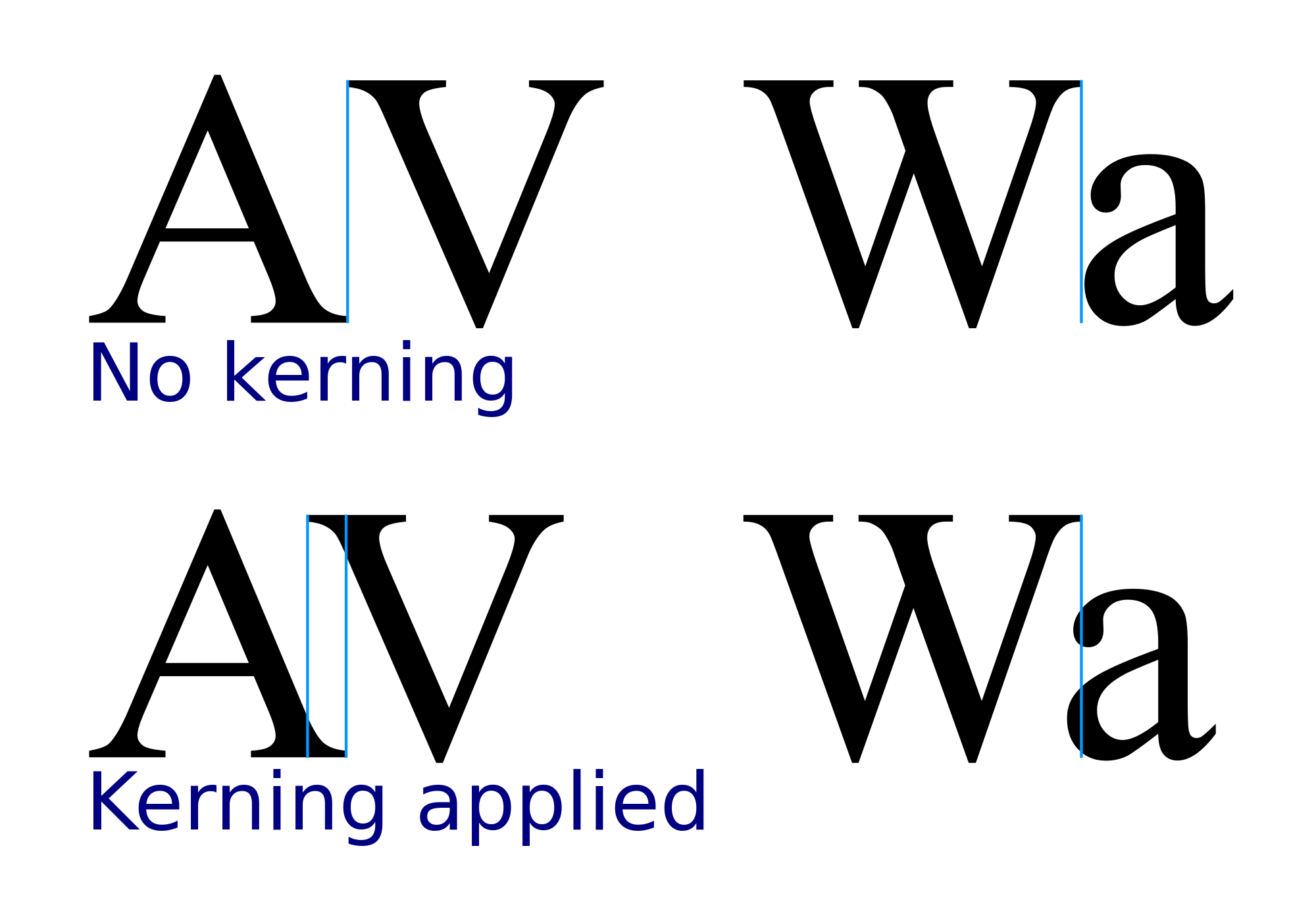
Leading and kerning
Kerning or mortising is the process of adjusting the spacing between characters, this is due to make specified text take up more or less space. This can also add effects to the words drawing attention to them, or making specific words/phrases less noticeable than other text. Leading is space between lines rather than texts. That is the main difference between kerning and leading.

Subscribe to:
Posts (Atom)